Autumn weddings are renowned for their rich, warm color palettes that echo the natural changes of the season. As we look towards 2027, the trend continues with a sophisticated mix of traditional and contemporary hues that can beautifully transform any wedding into a seasonal spectacle. Here’s how to utilize these color trends to create a stunning autumnal wedding.
Leading Color Trends for Autumn 2026
1. Chocolate Brown
A few years ago, almost no couple would have considered brown for a wedding. Today it is the shade I find myself suggesting most often for autumn celebrations, and the one that surprises couples the most when they see it in place.
Chocolate brown is deeper and more decisive than the soft mocha tones that dominated recent seasons. It reads as warmth rather than neutrality, and it carries a quiet luxury that photographs beautifully in the low, golden light of an Italian autumn. Where a pale neutral can disappear against stone and water, chocolate holds its own.
It works across far more elements than couples expect: bridesmaid dresses in silk or velvet, table linens, stationery suites, ribbon, and increasingly within the floral palette itself through dried seed heads, chocolate cosmos and deep burgundy dahlias.
Pair it with ivory and champagne for restraint, with caramel and muted gold for warmth, or with dusty rose if you want softness without sweetness.
2. Burgundy
A timeless autumn favorite, burgundy adds a touch of elegance and drama to any wedding palette. It works particularly well in floral designs, bridesmaid dresses, and as an accent in stationery and decor. Burgundy can be complemented with softer hues like peach or dusty pink to create a balanced and harmonious look.
3. Caramel and Burnt Orange
These warm, inviting tones reflect the quintessential colors of fall foliage. Caramel and burnt orange are excellent for creating a cozy atmosphere, especially in outdoor settings. Use these colors in your table settings, wedding favors, and ceremony backdrop to enhance the seasonal vibe.
4. Champagne and Ivory
For a subtle and sophisticated look, soft neutrals like champagne and ivory offer a clean and classic foundation that allows other colors to shine. These hues are particularly effective in creating an elegant and understated look in wedding attire, cakes, and floral arrangements.
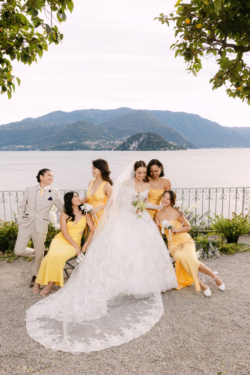
5. Yellow Accents
To add a pop of brightness to your autumn palette, consider incorporating yellow accents. This cheerful hue can bring a lively contrast to deeper autumnal tones and is fantastic for adding a burst of energy to bouquet ribbons, table centerpieces, or groomsmen’s boutonnieres.
Choosing Your Palette by Month
Autumn in Italy is not one season but three, and the difference between an early September wedding and one in mid November is far greater than most couples imagine. The light changes, the landscape changes, and a palette that feels luminous in September can feel thin by November.
Here is how I guide couples through it.
September Weddings
September still belongs to summer in most of Italy. The gardens are full, the water holds its colour, and the light stays warm and generous well into the evening. It is the busiest month of the season on Lake Como, and for good reason.
This is not the month for heavy autumnal tones. Deep burgundy and chocolate can feel premature against so much green, and photographs will show it. Instead I steer couples towards palettes that acknowledge the turn of the season without rushing it: butter yellow with olive green and champagne, or soft caramel layered over ivory with a single deeper accent.
The advantage of September is that you can still work with garden roses, dahlias and cosmos at their peak, which gives a florist far more to build with than later in the season.
October Weddings
October is the month the colours everyone associates with autumn actually arrive. The foliage turns, the light drops lower and warmer, and the deeper end of the palette finally has something to answer to.
This is where burgundy, plum, caramel and chocolate brown come into their own. Blackberry and aubergine work beautifully for evening receptions, particularly inside historic villas where candlelight does half the work. If you have been drawn to a moody palette, October is the month that will carry it.
A practical note I give every couple planning for October: the weather is genuinely unpredictable, and a serious indoor alternative is not a compromise but part of the design. The good news is that the richer autumn palettes look extraordinary indoors, against frescoed walls and stone.
November Weddings
By November the season has turned properly. The gardens are bare, the light is short and silver rather than gold, and the atmosphere shifts from abundance to intimacy. It suits smaller celebrations, and it suits couples who want something that feels quietly dramatic.
The palette follows: blackberry, midnight blue, deep charcoal and forest green, warmed with ivory and candlelight. This is also the month where silver, rather than gold, becomes the more interesting metal. Brushed silver, mirrored surfaces and crystal catch what little light there is and multiply it.
If you are planning for late November, it is worth reading my thoughts on winter weddings in Italy, because from here the two seasons begin to share the same design language.
How to Use These Colors
Venue and Decor
Choose a venue that complements these color trends. For instance, a vineyard or rustic barn pairs beautifully with a palette of burgundy, caramel, and burnt orange, enhancing the natural surroundings. Use drapes, table runners, and chair covers in your chosen colors to tie the theme together.
Floral Arrangements
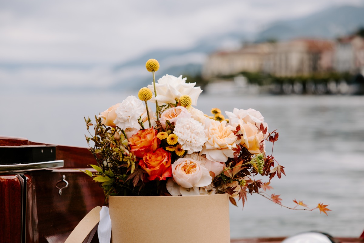
Autumn weddings are the perfect occasion to use seasonal botanicals. Incorporate leaves, berries, and branches into your floral arrangements. Flowers such as dahlias, marigolds, and chrysanthemums come in vibrant autumn colors and can create visually stunning bouquets and centerpieces.
Wedding Attire
Incorporate your color scheme into the wedding attire by choosing bridesmaid dresses in shades like Mocha Mousse or burgundy. For a more subtle incorporation, use these colors in accessories, such as ties, cufflinks, or shawls.
Stationery
Your wedding stationery is an excellent way to introduce your autumn color palette. Use combinations of your chosen colors for your save-the-dates, invitations, and day-of stationery to set the tone from the outset.
The Colour of the Year, and How to Use It
Every December, Pantone announces a Colour of the Year, and every January couples arrive asking whether they should build their wedding around it. My answer is usually the same: use it as a lens, not as a rule.
The current selection, Cloud Dancer, is a soft and balanced white described as a symbol of calm. It is a more useful choice for weddings than it might first appear. A warm white is not an absence of colour but a decision in its own right, and in autumn it does something specific: it keeps a deep palette from becoming heavy, and it reflects the low afternoon light back into the room.
Where these announcements genuinely help is in signalling direction. They tell you which way the wider design world is moving, which fabrics and finishes will be easy to source, and which will require a longer search. That is worth knowing when you are planning eighteen months ahead.
Where they do not help is in choosing for you. The palettes I remember are the ones that came from the couple, not from a press release.
Conclusion
The autumn of 2027 promises a palette that is both rich in tradition and fresh with contemporary influences. By thoughtfully incorporating these colors into your wedding, you can create a cohesive and memorable event that celebrates both your union and the beauty of the season.
Ready to start planning your autumn wedding with the perfect color palette? Contact me to explore how these 2027 trends can be beautifully integrated into your special day.